Rating Things I Bought for the Packaging (Asian Grocery Edition)
The Asian grocery store is one of my favourite places to find design inspiration. From colour combinations and layouts, to illustration styles to packaging materials, there’s always something that piques my interest. So, on this occasion, I let myself follow my curiosity and purchase some items to test if they tasted as good as they looked.
The Asian grocery store is one of my favourite places to find design inspiration. From colour combinations and layouts, to illustration styles to packaging materials, there’s always something that piques my interest.
Along with colour-blocking enthusiasts the world over, I was utterly drawn to IKEA’s latest collaboration with Dutch design duo Raw Color.
I don’t think the term “wine bar” really suits Poly; it’s almost rude to not give the food some more attention.
The Sydney donut scene is rather excellent at the moment – lots of variety and something new seems to be popping up all the time. Here are a few recent circular-shaped, baked goods I’ve enjoyed!
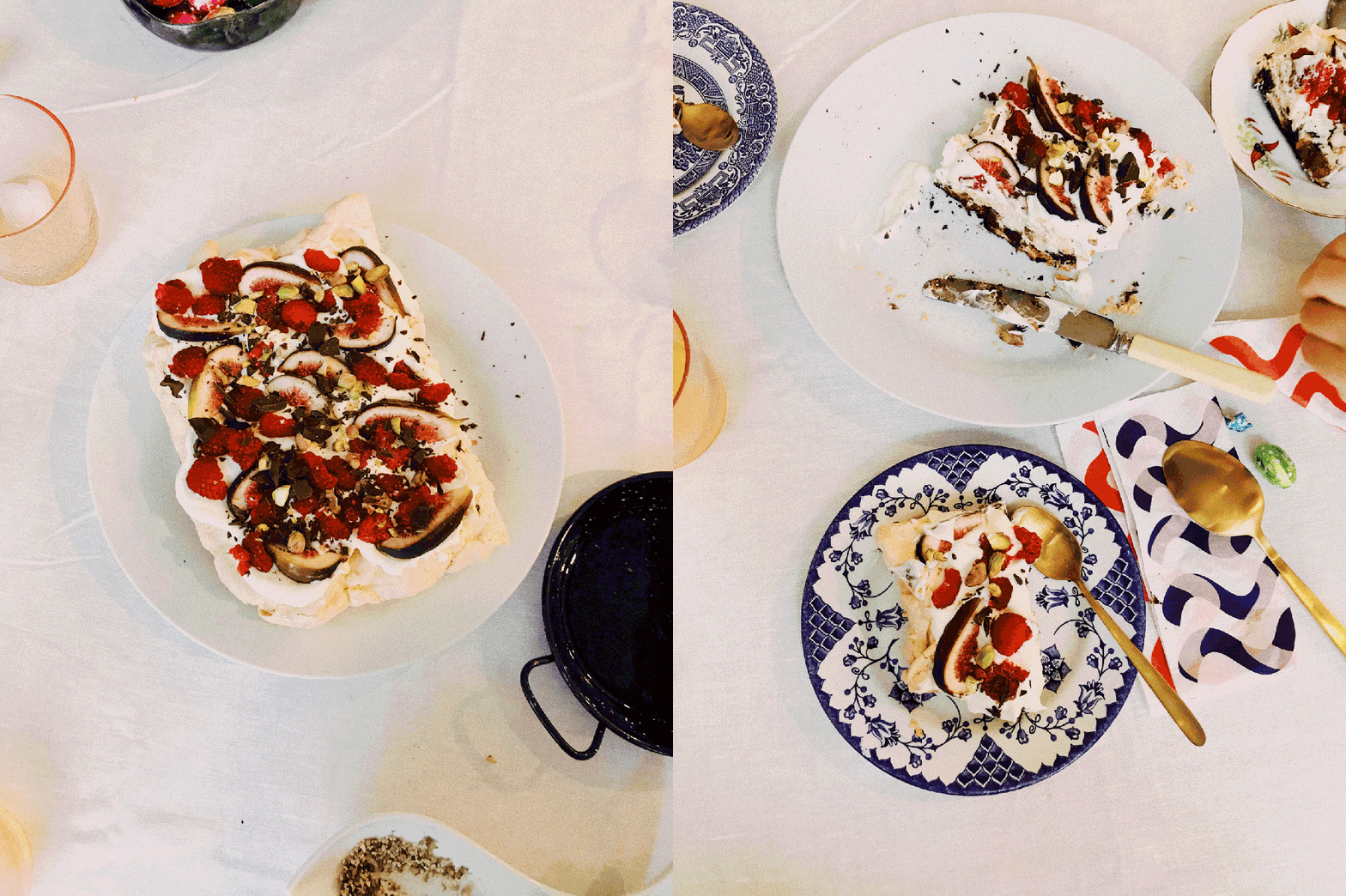
I recently made meringue for the first time and was very delighted by how straightforward and delicious it turned out, so thought I’d share the recipe.
We went to dinner at Templo on a cold, Tassie evening. The restaurant sits on its own, up a hill and a couple of streets away from the North Hobart restaurant strip. Its outfit is small and cosy, seating only 20 people.
The Agrarian Kitchen is dedicated to local, seasonal produce (demonstrated aptly when we were given a bowl of complimentary radishes, picked straight from the garden).
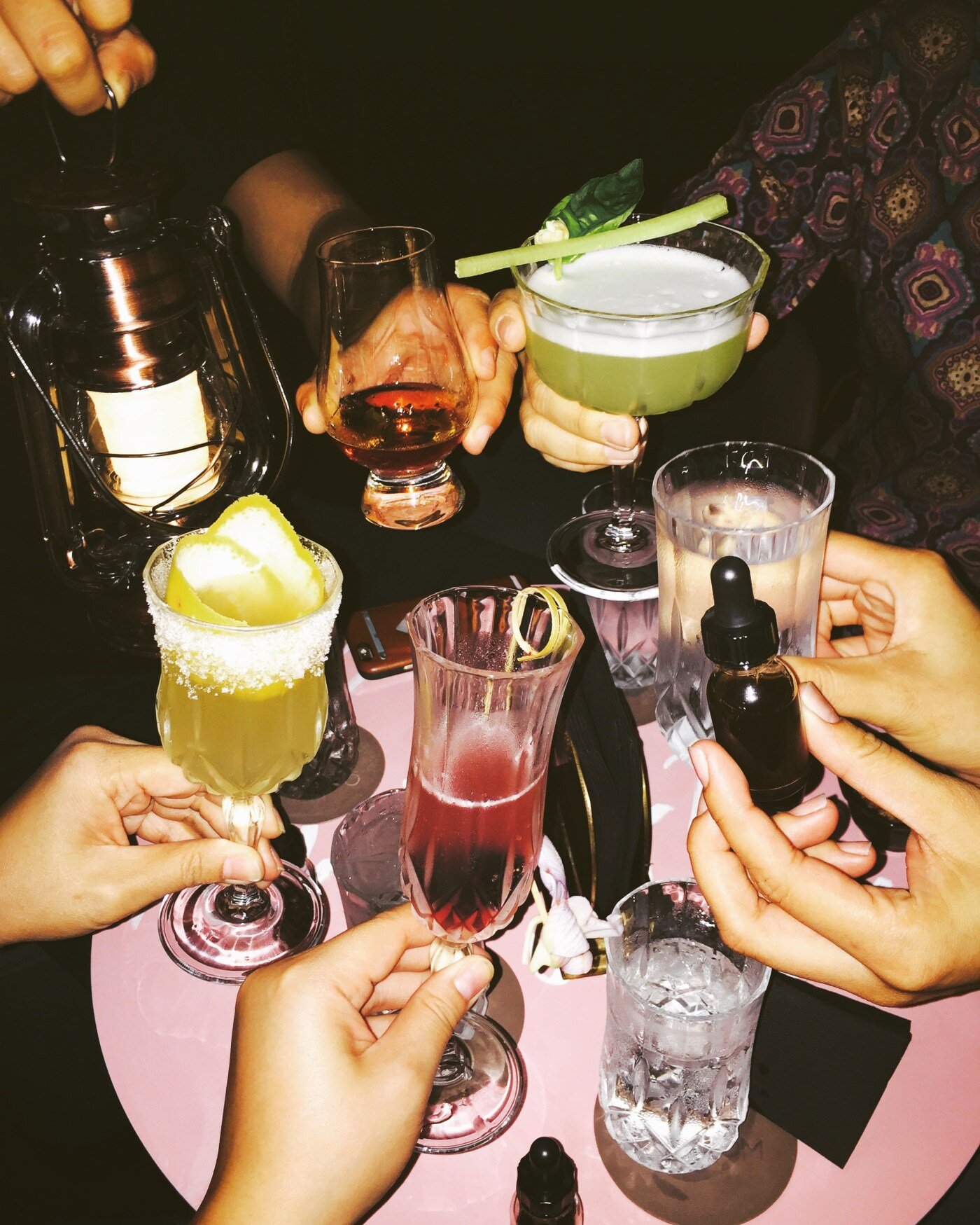
A few weeks ago, I travelled to Singapore – home to late night roti prata, my beloved extended family, and some of the neatest bars around.


